Second Story and Beyond
Second Story & Beyond: Transforming a Library into an Interactive Children's Museum
Client: City of Rancho Cucamonga I Design: CambridgeSeven I Fabricator: Xibitz I AV: Electrosonic & RLMG I Subcontractor: Boss Display
The Challenge
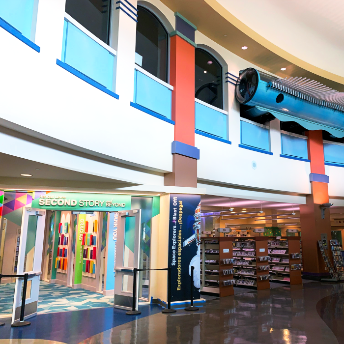
In an era where digital screens often dominate children’s attention, the City of Rancho Cucamonga, California, embarked on a daring journey to redefine the traditional library experience. Partnering with design experts CambridgeSeven and fabrication specialists Xibitz, the Rancho Cucamonga Public Library has unveiled a groundbreaking transformation of its second floor — now home to far more than books.
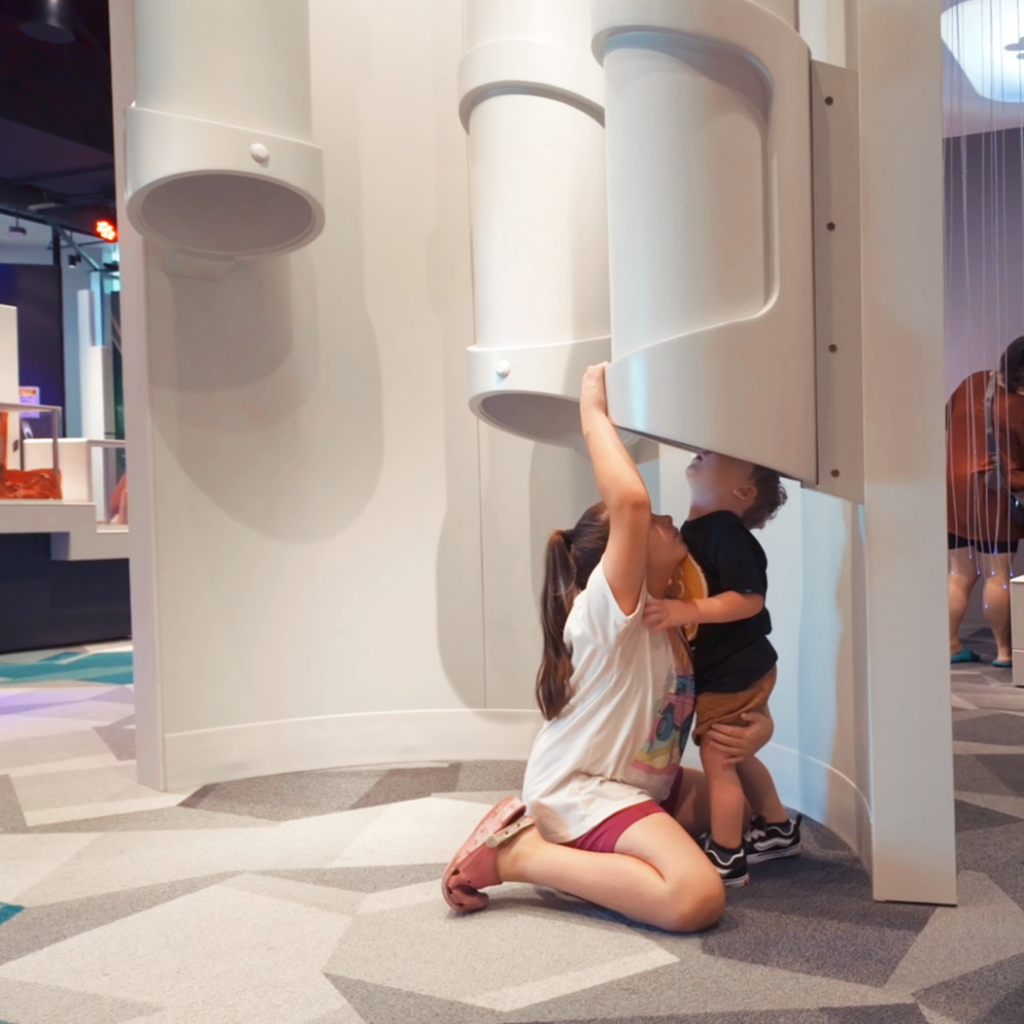
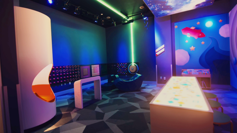
The aptly named Second Story and Beyond exhibition is an interactive wonderland that combines learning, sensory development, movement, and creativity. With a strong emphasis on Science, Technology, Engineering, and Mathematics (STEM), the new library floor is designed to nurture curiosity and foster a love for learning through carefully curated hands-on experiences.
The Result
This ambitious project was brought to life through the collaborative efforts of several key players:
- CambridgeSeven: Provided the visionary experience design
- Xibitz: Head of fabrication and overall project management
- Boss Display: Created the incredible water table and overhead climber
- Electrosonic: Implemented state-of-the-art AV hardware and media
- RLMG: Provided high quality media content
- Taylor Studios and Moss: Contributed specialized expertise to various elements
One of the most innovative aspects of this project is the exhibit’s adaptability. The entire floor can be updated with new graphic packages that run through every exhibit, ensuring that the space remains fresh and engaging for years to come. This forward-thinking approach allows the library staff to continually evolve the experience, keeping pace with educational trends and community needs.
The Rancho Cucamonga Public Library’s transformation illustrates how traditional institutions can evolve to meet the changing needs of their communities. By creating a space that encourages active learning, sensory exploration, and creative play, the library has positioned itself as an essential hub for childhood development and family engagement.
Want to see more? Check out our other Museum projects.
Red Hat
Innovation Meets Fabrication at Red Hat's Boston Office
Client: Red Hat I Design: Downstream I Fabricator: Xibitz
The Challenge
Red Hat’s Boston office brings together their Executive Briefing Center, Open Innovation Labs, and Engineering community under one roof. The environment needed to emphasize collaboration and inspiration, not only for the Red Hat internal team, but for their visiting clients and partners as well.
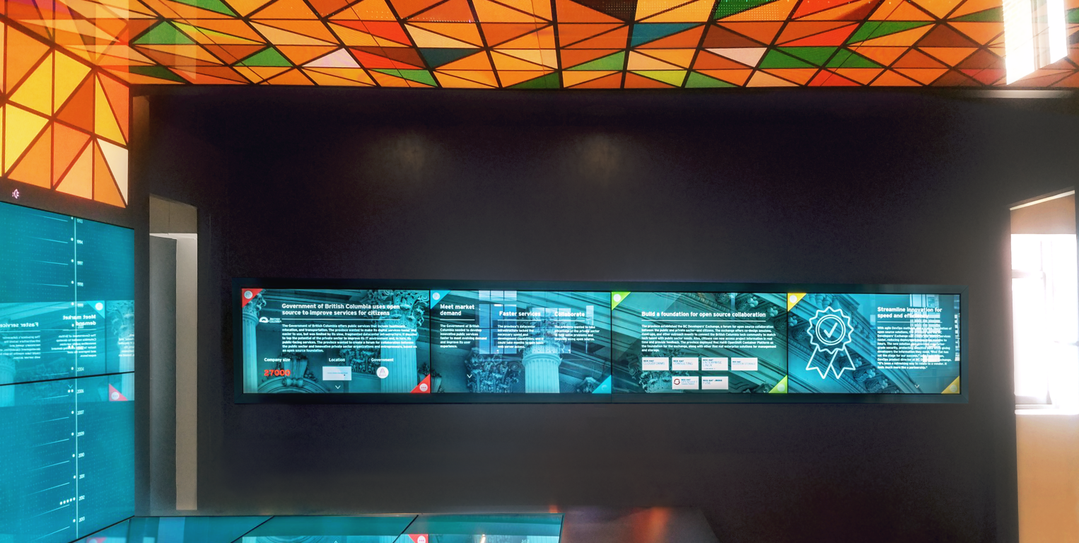
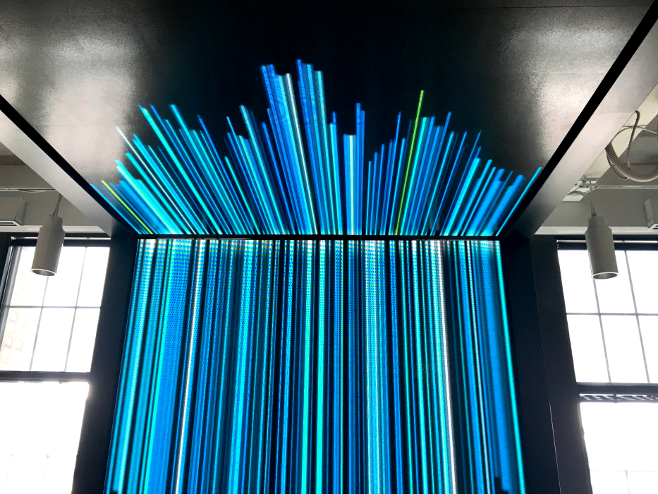
Connecting the executive space with the main floor is a fantastic 17-foot video wall. We developed a system that both supported the waterfall screens and enabled easy maintenance. The steel frames were built using a drawer-slide method, allowing each monitor to slide out from the wall. This seemingly-simple solution required extreme precision — the final result had to look like one continuous, solid piece.
The Result
With numerous media interactives throughout the space, exacting quality was demanded to ensure an immersive, fluid experience. Guided by Downstream’s design vision, we successfully implemented custom graphics, displays, and a suite of technological solutions.
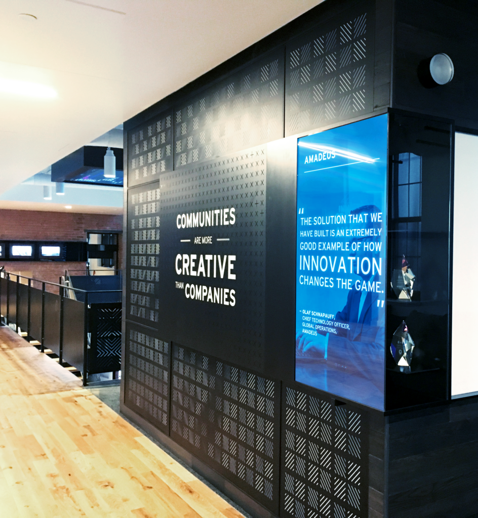
The Executive Briefing Center is a perfect example: wrapped in wall-to-wall touchscreen technology, it’s a testament of Red Hat’s own software solutions, while simultaneously fostering further collaboration and ideation.
From the responsive reception wall to the hidden bar, surprising and delightful moments bring energy and excitement to the space. Every addition contributes to a sense of wonder and inspiration — the perfect atmosphere for one of the world’s largest and most innovative tech companies.
Want to see more? Check out our other Corporate projects.
Local 4
Lights, Camera, Action: Local 4's Studio Transformation
Client: Local 4 I Design: Wright Sets I Fabricator: Xibitz
The Challenge
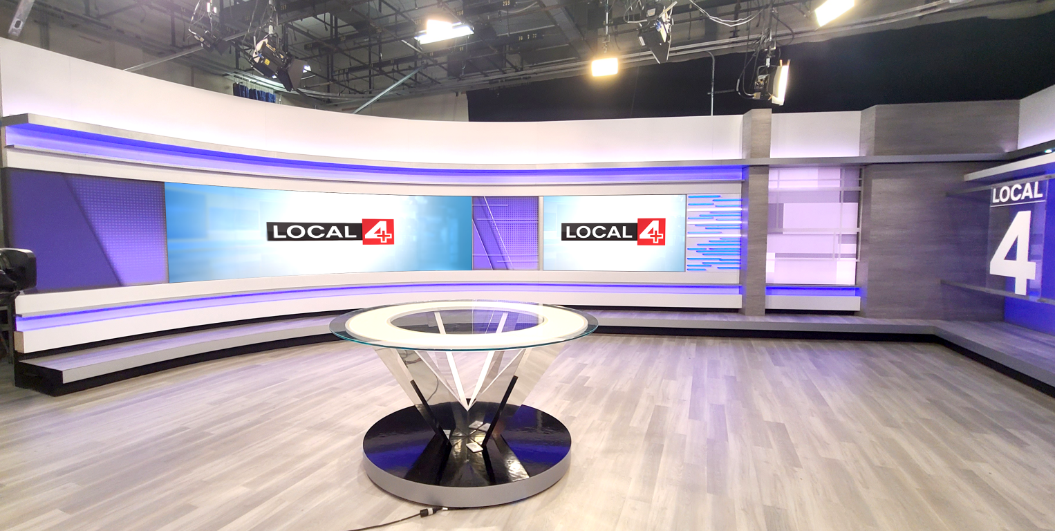
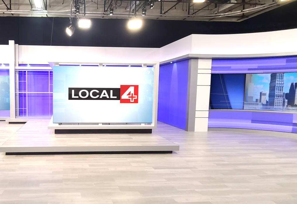
This was no superficial upgrade. Local 4 wanted a completely new set, replacing their outdated fixtures and green screens with sophisticated LED technology and a spacious, modern design.
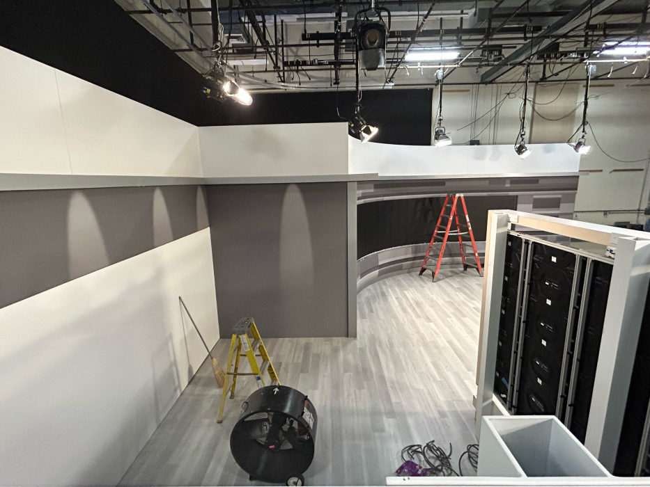
The entire set is supported by a robust frame produced in our workshop, designed to support the massive screens while allowing for passage behind the electronics for easy maintenance.
Surprisingly, the SEG system for this project is one of the standout elements. A network of LED’s provides color behind the grey SEG’s. Sophisticated mock-ups were required to achieve the precise color density to ensure a realistic look.
The Result
This redesign has transformed the news studio from top to bottom. With new sets for news, sports, and the weather, the space is more energizing, inspiring, and immersive.
We are tremendously grateful to the Local 4 team for their trust and support throughout the project. It was a pleasure collaborating with Michael Wright and our partners at ReveLux to bring this design to life.
Want to see more? Check out our other Corporate projects.
Duke Tennis
Game, Set, Match: Transforming Duke’s Tennis Center
Client: Duke Athletics I Design: ZEBRADOG I Fabricator: Xibitz
The Challenge
We teamed up with the creative masterminds at ZEBRADOG to give the Sheffield Indoor Tennis Center a major redesign. Our mission was to turn the facility into a place that not only better accommodates the needs of the staff and the men’s and women’s teams, but also into a place of pride for the esteemed program.
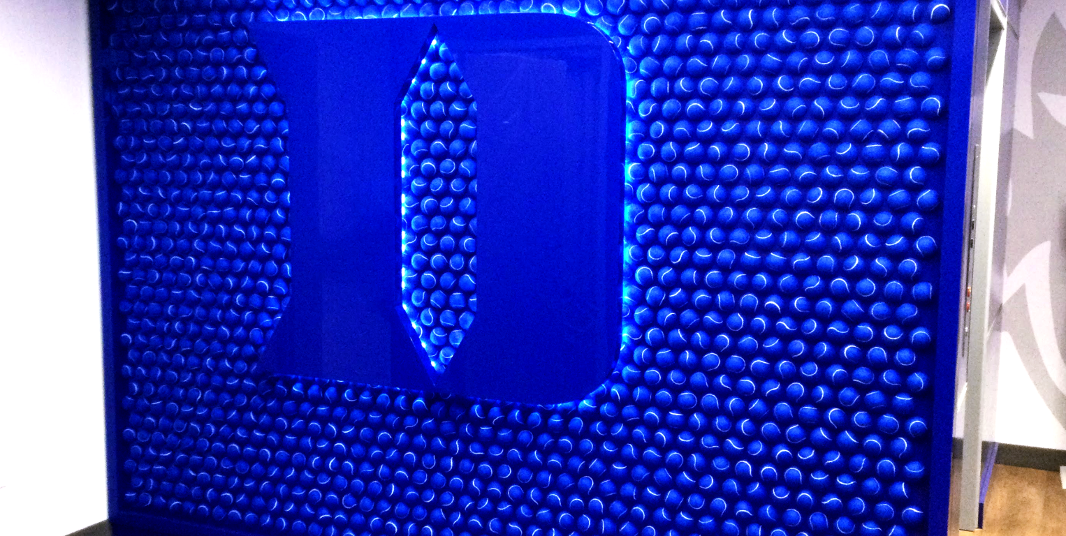
As the fabrication partner, we were responsible for carrying out that bold vision. From the signature blue tennis ball wall that greets guests at the entrance to the thoughtfully-designed team lounge, the details in this space are breathtaking.
The Result
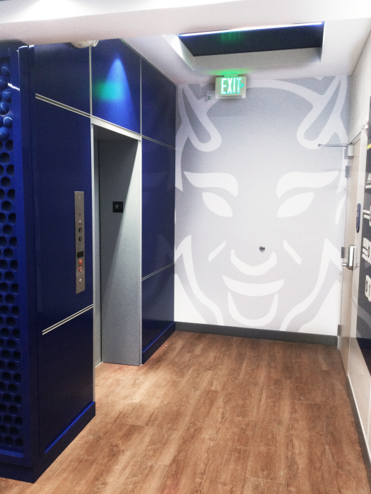
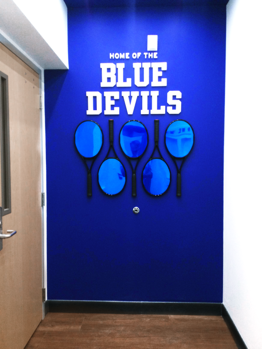
Tennis rackets and other materials combine with more traditional acrylic, metal, and wood to create an interior that is truly unique and intentional. Every element pays homage to the sport and the program: the tennis-ball inspired locker room light fixtures, the larger-than-life Hellraiser face, the mirrored Blue Devils wall.
It was a pleasure working with our partners at ZEBRADOG on this project, and of course we are tremendously grateful to the staff at Duke Athletics for all their hard work and support.
This redesign transformed the facility from top to bottom. The new space is a celebration of Duke University and the tennis program that is modern, energized, and inspired.
Want to see more? Check out our other Athletics projects.
Salt Lake City Feature Wall
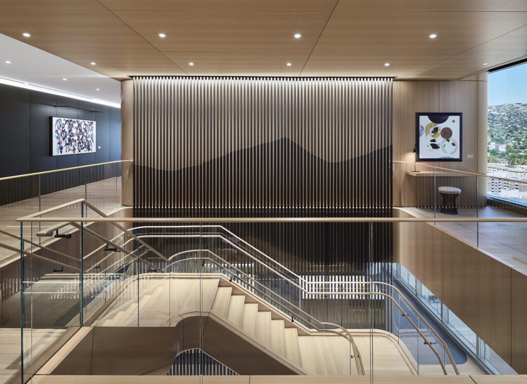
Building a mountain-inspired feature wall
Client: Confidentail I Designer: Perkins&Will I Fabricator: Xibitz
This impressive feature wall, spanning 52 feet across and 4 stories high, transformed the client’s Salt Lake City office. The monumental wall celebrates the breathtaking view of the Wasatch Mountain Range and gives a whole new meaning to “bringing the outside in.” It was a delight working in collaboration with Perkins&Will on this project. They translated this vision with a stunning level of precision and passion.
The project’s massive scale presented unique challenges, particularly in addressing building deflection across multiple floors. Our teams developed an ingenious solution using custom-made and 3D-printed components that allowed for slight vertical and horizontal movement, ensuring the installation remains stable and visually seamless.
The curtain wall is composed of different widths of anodized bronze tubes, strung with steel tension cable, suspended from the ceiling of the 20th floor. Lighting was integrated at the top, midpoint, and bottom of the wall. The result is a striking work of art that reflects the clients’ status and honors Utah’s unique natural landscape.
Want to see more? Check out our other corporate projects.
CNO Financial Group
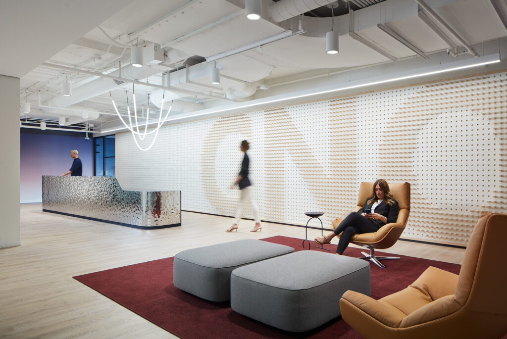
Bespoke Branded Environment for CNO Reception Lobby
Client: CNO Financial Group I Designer: SCB I Fabricator: Xibitz
Xibitz was privileged to collaborate with SCB on this brand wall, designed to complement the CNO Financial Group reception lobby.
By using powder-coated wood panels and pegs, the letters C, N, and O are made visible from all angles. The wall harmonizes with the overall interior design while providing a special, surprising moment.
The attention to detail and planning from the designers at SCB made this project a real success. The final product looks seamless, although it’s made of several different components. The level of quality is a testament to the design team’s planning and coordination and Xibitz’ execution. The final piece speaks to the methodic design cues that contributed to the sophistication of the overall space.
The brand wall required a high level of craftsmanship, from the millwork details to the architectural alignment of the components. We are honored to have been able to contribute our expertise.
Want to see more? Check out our other corporate projects.
Howard University
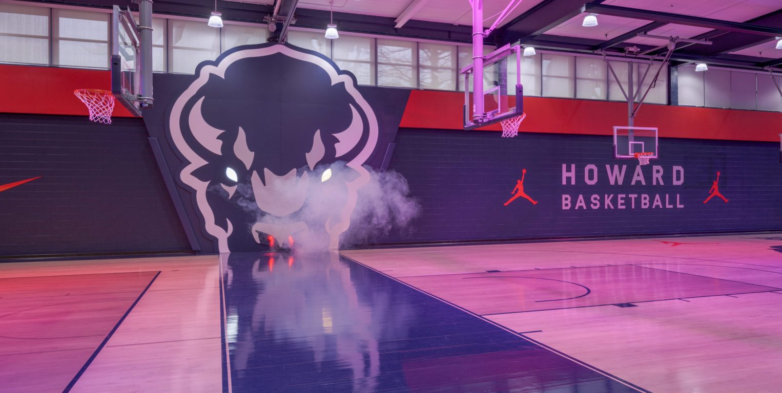
A Fresh Look For Howard University's Practice Facility
Client: Howard University I Design: ZEBRADOG I Architect: The Beck Group I Fabricator: Xibitz
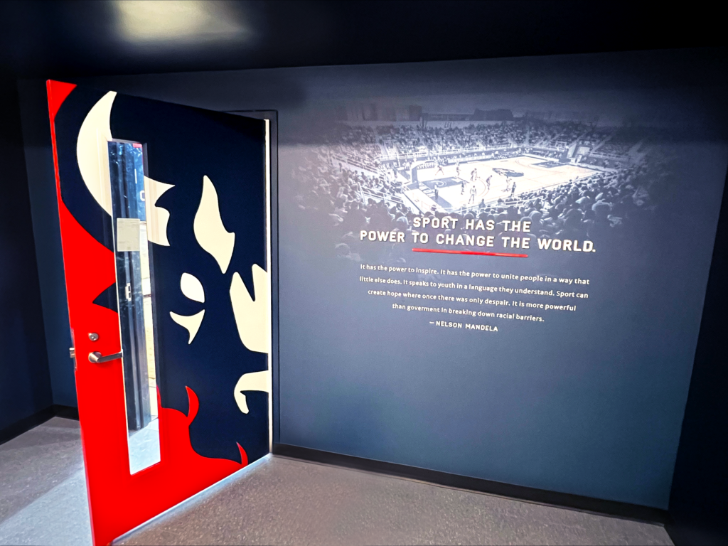
Old Gym, New Style
ZEBRADOG led the charge on this bold redesign of Howard University’s 1963 practice facility. Affectionately known as The Burr, this gym is now home to Howard’s DI basketball and volleyball teams. A refresh was sorely needed. Not just to update the old building, but also to celebrate the past and current achievements of these programs.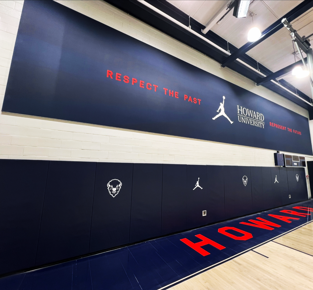
A Little Steam Goes a Long Way
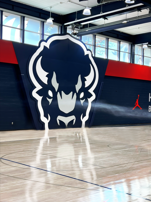
Statement graphics throughout the building celebrate Howard’s spirit in a modern style. Xibitz produced and installed window treatments, vinyl lettering, banners, wall panels, and more.
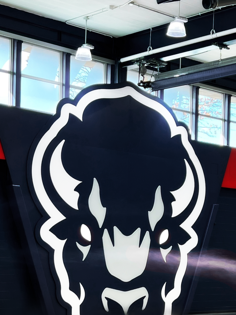
The star of the show is the 20-foot-tall Bison head that blows real steam from its nostrils when activated. Our team laid the complex statement piece seamlessly to create the perfect photo-op moment for prospective Bison athletes.
The final result is a celebration of Howard’s legacy and proof of their commitment to their students. It was an honor to contribute on this renovation, and we hope that the new look inspires the next generation of Bison athletes!
#BleedBlue #GoBison
Want to see more? Check out our other Athletics projects.
Angel’s Envy Bourbon Club
A Floating Cardinal for University of Louisville Angel’s Envy Bourbon Club
The University of Louisville had two asks. The first: to create a statement piece for the Schnellenberger Football Complex entrance. And the second: redesign the stadium’s Angels’ Envy Bourbon Club to provide a premium experience for guests.
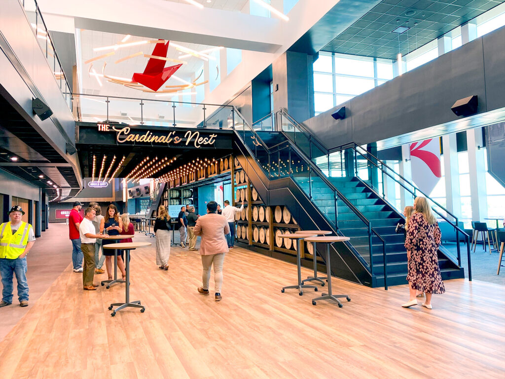
Xibitz crafted the club’s new fantastic centerpiece: a gigantic metal cardinal that hangs elegantly from the ceiling. The welded-aluminum sculpture hammers home the bond between the Club and the Louisville Cardinals.
Xibitz also constructed the 8-foot long metal and copper bands floating around the cardinal, an homage to the barrel staves used to store whiskey and bourbon.
Michigan State Football
Lansing, Michigan
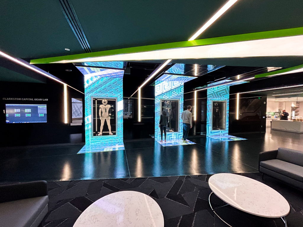
Unveiling the New Michigan State Tom Izzo Football Building
Xibitz partnered with Jack Porter to revamp the Tom Izzo Football Building for the Michigan State Spartans. A program with six national championships needs an awe-inspiring transformation, and Jack Porter delivered. Using Jack Porter’s designs, Xibitz fabricated and installed new display cases, interactive pieces, and more.
A Social Hub
One of the most notable areas is the Nike equipment room. The finished product includes meticulously-crafted custom floating shelves to house Nike gear available for the players use along with a modern lounge space. An interactive LED display invites visitors to personalize their experience by customizing a Spartan jersey. As visitors approach what seems to be a black screen, a motion-activated sensor reveals transparent glass, showcasing MSU’s three distinct jerseys while an LED array highlights the visitor’s personalized selection, immersing them in the team’s identity.
Celebrating Program Achievements
In the corridor leading to the Nike equipment room, our team installed high gloss panels that showcase the players’ accomplishments, emphasizing the rich history and achievements of Spartan football. We also crafted bespoke awards for the National Award Winners Hallway to honor individual achievements. This addition reinforces the culture of excellence within the team.
Upon entering the main foyer, visitors are greeted by a striking LED array mounted on a faceted wall, accompanied by four National Championship awards. These awards, an ingenious and unique design by Jack Porter, serve as a powerful testament to the team’s success.
Our collaboration with Jack Porter and our meticulous attention to detail have transformed the football facility into a space that reflects the legacy of Spartan football—and also fosters a profound sense of pride and connection for players and visitors alike.